[R语言] ggplot2入门笔记2—通用教程ggplot2简介


通用教程简介(IntroductionToggplot2)代码下载地址以前,我们看到了使用ggplot2软件包制作图表的简短教程。它很快涉及制作ggplot的各个方面。现在,这是一个完整而完整......
代码下载地址以前,我们看到了使用ggplot2软件包制作图表的简短教程。它很快涉及制作ggplot的各个方面。现在,这是一个完整而完整的教程。现在讨论如何构造和自定义几乎所有ggplot。它涉及的原则,步骤和微妙之处,使图像的情节有效和更具视觉吸引力。因此,出于实用目的,我希望本教程可以作为书签参考,对您日常的绘图工作很有用。
这是ggplot2的三部分通用教程的第1部分,ggplot2是R中的美观(非常流行)的图形框架。该教程主要针对具有R编程语言的一些基本知识并希望制作复杂且美观的图表的用户与Rggplot2。
ggplot2简介(Introductiontoggplot2)
自定义外观(CustomizingtheLookandFeel)
前50个ggplot2可视化效果(top50ggplot2Visualizations)
ggplot2简介涵盖了有关构建简单ggplot以及修改组件和外观的基本知识;自定义外观是关于图像的自定义,如使用多图,自定义布局操作图例、注释;前50个ggplot2可视化效果应用在第1部分和第2部分中学到的知识来构造其他类型的ggplot,例如条形图,箱形图等。
2ggplot2入门笔记2—通用教程ggplot2简介本章节简介涵盖了有关构建简单ggplot以及修改组件和外观的基本知识,该章节主要内容有:
了解ggplot语法(UnderstandingtheggplotSyntax)
如何制作一个简单的散点图(HowtoMakeaSimpleScatterplot)
如何调整XY轴范围(HowtoAdjusttheXandYAxisLimits)
如何更改标题和轴标签(HowtoChangetheTitleandAxisLabels)
如何更改点的颜色和大小(HowtoChangetheColorandSizeofPoints)
如何更改X轴文本和刻度的位置(HowtoChangetheXAxisTextsandTicksLocation)
参考文档
1.了解ggplot语法(UnderstandingtheggplotSyntax)如果您是初学者或主要使用基本图形,则构造ggplots的语法可能会令人困惑。主要区别在于,与基本图形不同,ggplot适用于数据表而不是单个矢量。绘图所需的所有数据通常都包含在提供给ggplot()本身的数据框中,或者可以提供给各个geom。第二个值得注意的功能是,您可以通过向使用该ggplot()功能创建的现有图上添加更多层(和主题)来继续增强图。
让我们根据midwest数据集初始化一个基本的ggplot
turnoffscientificnotationlike1e+06options(scipen=999)library(ggplot2)显示数据head(midwest)areaandpoptotalarecolumnsin'midwest'ggplot(midwest,aes(x=area,y=poptotal))
Warningmessage:"package'ggplot2'"
Atibble:6×28
PID
county
state
area
poptotal
popdensity
popwhite
popblack
popamerindian
popasian
percollege
percprof
poppovertyknown
percpovertyknown
percbelowpoverty
percchildbelowpovert
percadultpoverty
percelderlypoverty
inmetro
category
int
chr
chr
dbl
int
dbl
int
int
int
int
dbl
dbl
int
dbl
dbl
dbl
dbl
dbl
int
chr
561
ADAMS
IL
0.052
66090
1270.9615
63917
1702
98
249
19.63139
4.355859
63628
96.27478
13.151443
18.01172
11.009776
12.443812
0
AAR
562
ALEXANDER
IL
0.014
10626
759.0000
7054
3496
19
48
11.24331
2.870315
10529
99.08714
32.244278
45.82651
27.385647
25.228976
0
LHR
563
BOND
IL
0.022
14991
681.4091
14477
429
35
16
17.03382
4.488572
14235
94.95697
12.068844
14.03606
10.852090
12.697410
0
AAR
564
BOONE
IL
0.017
30806
1812.1176
29344
127
46
150
17.27895
4.197800
30337
98.47757
7.209019
11.17954
5.536013
6.217047
1
ALU
565
BROWN
IL
0.018
5836
324.2222
5264
547
14
5
14.47600
3.367680
4815
82.50514
13.520249
13.02289
11.143211
19.200000
0
AAR
566
BUREAU
IL
0.050
35688
713.7600
35157
50
65
195
18.90462
3.275891
35107
98.37200
10.399635
14.15882
8.179287
11.008586
0
AAR
上面绘制了一个空白ggplot。即使指定了x和y,也没有点或线。这是因为ggplot并不假定您要绘制散点图或折线图。我只告诉ggplotT使用什么数据集,哪些列应该用于X和Y轴。我没有明确要求它画出任何点。还要注意,该aes()功能用于指定X和Y轴。这是因为,必须在aes()函数中指定属于源数据帧的任何信息。
2.如何制作一个简单的散点图(HowtoMakeaSimpleScatterplot)让我们通过使用称为的geom层添加散点图,在空白ggplot基础制作一个散点图geom_point。
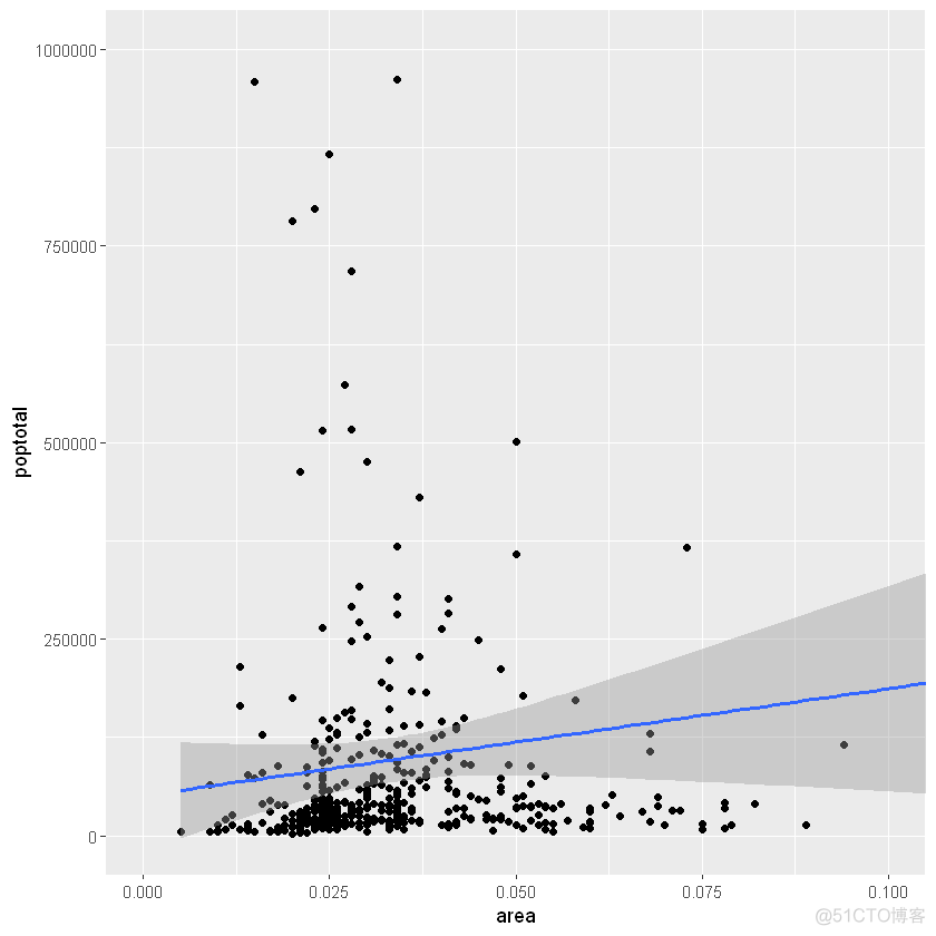
library(ggplot2)ggplot(midwest,aes(x=area,y=poptotal))+geom_point()
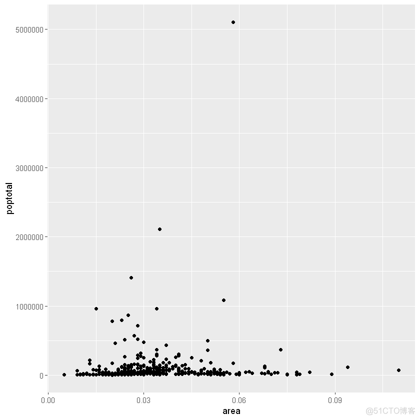
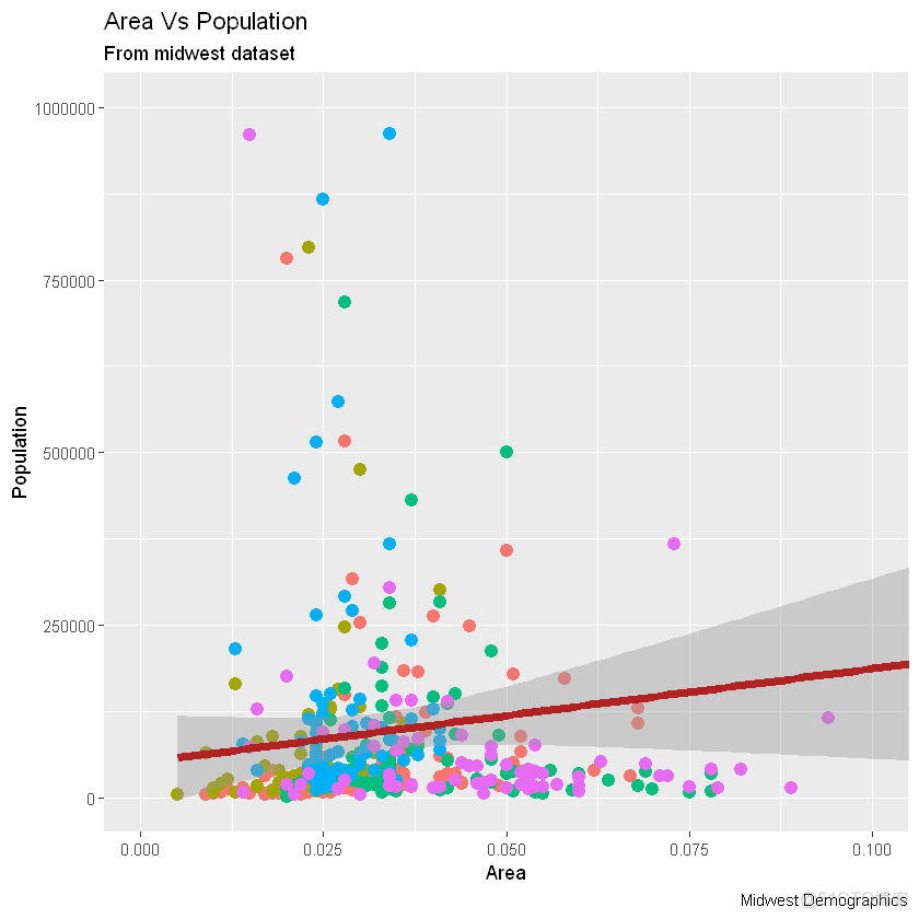
我们得到了一个基本的散点图,其中每个点代表一个县。但是,它缺少一些基本组成部分,例如绘图标题,有意义的轴标签等。此外,大多数点都集中在绘图的底部,这不太好。您将在接下来的步骤中看到如何纠正这些问题。
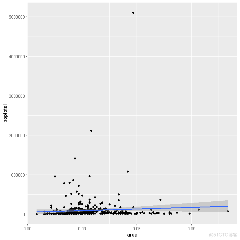
像geom_point()一样,有许多这样的geom层,我们将在本教程系列的后续部分中看到。现在,让我们使用geom_smooth(method=‘lm’)添加一个平滑层。由于该方法被设置为lm(线性模型的简称),所以它会画出最适合的拟合直线。
g-ggplot(midwest,aes(x=area,y=poptotal))+geom_point()+设置se=FALSE来关闭置信区间geom_smooth(method="lm",se=TRUE)plot(g)
X轴和Y轴范围可以通过两种方式控制。
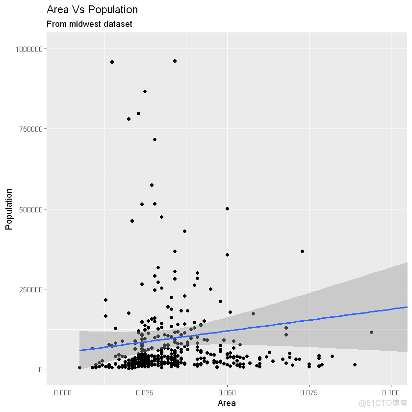
3.1方法1:通过删除范围之外的点与原始数据相比,这将更改最佳拟合线或平滑线。这可以通过xlim()和ylim()完成。可以传递长度为2的数值向量(具有最大值和最小值)或仅传递最大值和最小值本身。
library(ggplot2)设置se=FALSE来关闭置信区间g-ggplot(midwest,aes(x=area,y=poptotal))+geom_point()+geom_smooth(method="lm")deletespoints删除点g+xlim(c(0,0.1))+ylim(c(0,1000000))setse=FALSEtoturnoffconfidencebandsgeom_smooth(method="lm")Asaresult,thelineofbestfitisthesameastheoriginalplot.画图限制范围g1-g+coord_cartesian(xlim=c(0,0.1),ylim=c(0,1000000))AddTitleandLabels另外一种方法g1+ggtitle("AreaVsPopulation",subtitle="Frommidwestdataset")+xlab("Area")+ylab("Population")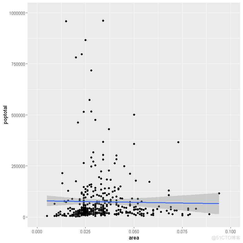
优秀!因此,这是完整功能调用。
画图ggplot(midwest,aes(x=area,y=poptotal))+设置固定颜色和尺寸geom_point(col="steelblue",size=3)+更改拟合直线颜色geom_smooth(method="lm",col="firebrick")+coord_cartesian(xlim=c(0,0.1),ylim=c(0,1000000))+labs(title="AreaVsPopulation",subtitle="Frommidwestdataset",y="Population",x="Area",captinotallow="MidwestDemographics")
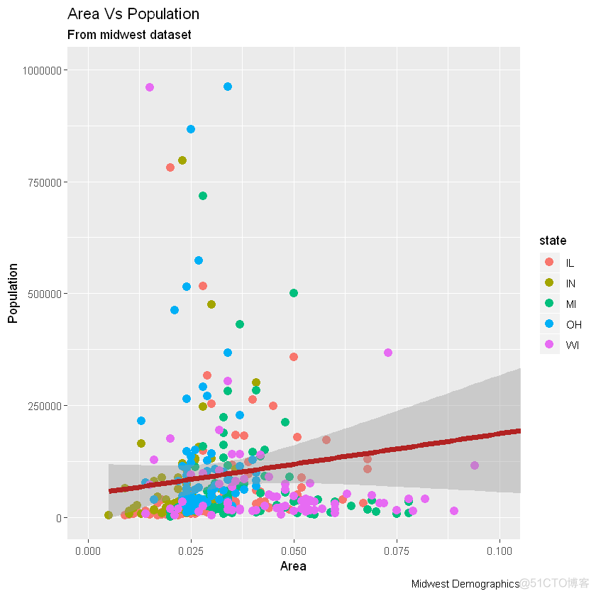
假设我们要根据源数据集中的另一列更改颜色midwest,则必须在aes()函数内指定颜色。
library(ggplot2)gg-ggplot(midwest,aes(x=area,y=poptotal))+根据状态类别将颜色设置为不同。geom_point(aes(col=state),size=3)+geom_smooth(method="lm",col="firebrick",size=2)+coord_cartesian(xlim=c(0,0.1),ylim=c(0,1000000))+labs(title="AreaVsPopulation",subtitle="Frommidwestdataset",y="Population",x="Area",captinotallow="MidwestDemographics")plot(gg)

现在,每个点都基于aes所属的状态(col=state)上色。不只是颜色,大小、形状、笔划(边界的厚度)和填充(填充颜色)都可以用来区分分组。作为附加的优点,图例将自动添加。如果需要,可以通过在theme()函数中将设置为None来删除它。
changecolorpalette更改调色板gg+scale_colour_brewer(palette="Set1")
在RColorBrewer软件包中可以找到更多这样的调色板,具体颜色显示见网页
library(RColorBrewer)head(,10)
:10×3
maxcolors
category
colorblind
dbl
fct
lgl
BrBG
11
div
TRUE
PiYG
11
div
TRUE
PRGn
11
div
TRUE
PuOr
11
div
TRUE
RdBu
11
div
TRUE
RdGy
11
div
FALSE
RdYlBu
11
div
TRUE
RdYlGn
11
div
FALSE
Spectral
11
div
FALSE
Accent
8
qual
FALSE
6.如何更改X轴文本和刻度的位置(HowtoChangetheXAxisTextsandTicksLocation)本节主要内容有:
如何更改X和Y轴文本及其位置?(HowtoChangetheXandYAxisTextanditsLocation?)
如何通过设置原始值的格式为轴标签编写自定义文本?(HowtoWriteCustomizedTextsforAxisLabels,byFormattingtheOriginalValues?)
如何使用预置主题一次性定制整个主题?(HowtoCustomizetheEntireThemeinOneShotusingPre-BuiltThemes?)
6.1如何更改X和Y轴文本及其位置?(HowtoChangetheXandYAxisTextanditsLocation?)好了,现在让我们看看如何更改X和Y轴文本及其位置。这涉及两个方面:breaks和labels。
第1步:设置breaks
坐标轴间隔breaks的范围应该与X轴变量相同。注意,我使用的是scale_x_continuous,因为X轴变量是连续变量。如果它是一个日期变量,那么可以使用scale_x_date。与scale_x_continuous()类似,scale_y_continuous()也可用于Y轴。
library(ggplot2)SetcolortovarybasedonstatecategoriesChangebreaksBaseplotgg-ggplot(midwest,aes(x=area,y=poptotal))+设置颜色geom_point(aes(col=state),size=3)+geom_smooth(method="lm",col="firebrick",size=2)+coord_cartesian(xlim=c(0,0.1),ylim=c(0,1000000))+labs(title="AreaVsPopulation",subtitle="Frommidwestdataset",y="Population",x="Area",captinotallow="MidwestDemographics")letters字母表gg+scale_x_continuous(breaks=seq(0,0.1,0.01),labels=letters[1:11])
如果需要反转刻度,请使用scale_x_reverse()/scale_y_reverse()
library(ggplot2)SetcolortovarybasedonstatecategoriesReverseXAxisScaleBaseplotgg-ggplot(midwest,aes(x=area,y=poptotal))+设置颜色geom_point(aes(col=state),size=3)+geom_smooth(method="lm",col="firebrick",size=2)+coord_cartesian(xlim=c(0,0.1),ylim=c(0,1000000))+labs(title="AreaVsPopulation",subtitle="Frommidwestdataset",y="Population",x="Area",captinotallow="MidwestDemographics")更改x轴scale_x_continuous(breaks=seq(0,0.1,0.01),labels=sprintf("%1.2f%%",seq(0,0.1,0.01)))+Baseplotgg-ggplot(midwest,aes(x=area,y=poptotal))+method1:Usingtheme_set()theme_set(theme_classic())gg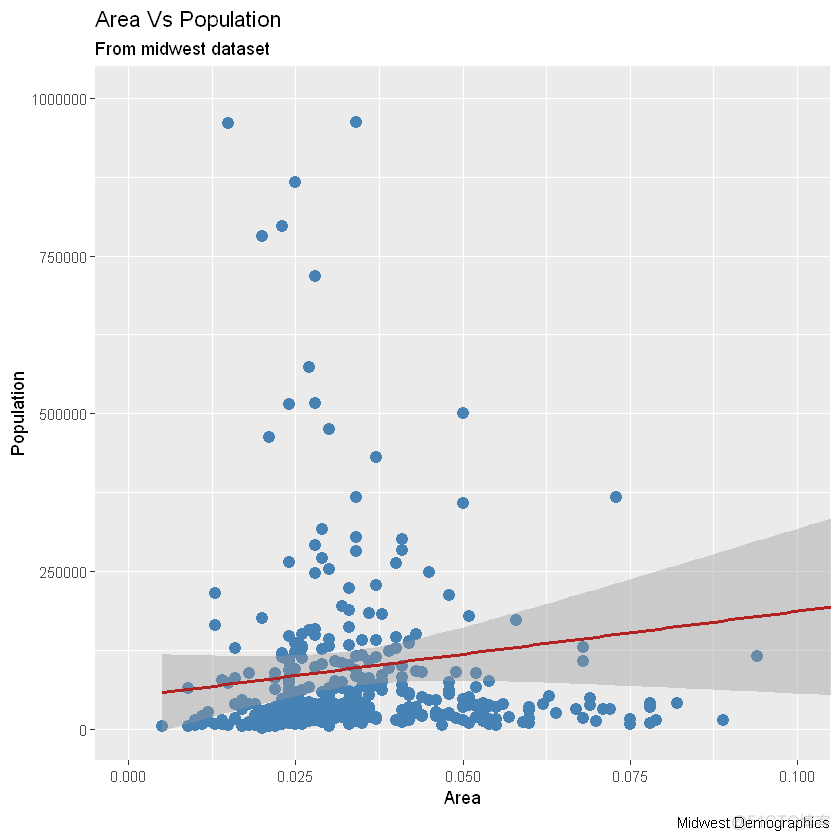
添加主题层gg+theme_bw()+labs(subtitle="BWTheme")
gg+theme_classic()+labs(subtitle="ClassicTheme")
本文链接:https://goko.jsntrg.cn/825622047576.html